> ## Documentation Index
> Fetch the complete documentation index at: https://forest-docs-prd-616-workflow-webhook-trigger.mintlify.site/llms.txt
> Use this file to discover all available pages before exploring further.
# Smart Charts
> Code your own custom charts when no-code chart types aren't enough.
The no-code chart types (Single, Distribution, Time-based, Cohort, Leaderboard, Objective) cover most needs. When you want full control over how data is displayed, custom visualizations, external libraries, complex layouts, use **Smart Charts**.
With Smart Charts you write the data source on the back-end and the rendering component in the UI editor. There's no limit to what you can render: D3.js, custom SVG, embedded iframes, anything you can write in JavaScript.
## Creating a Smart Chart
From any dashboard or record analytics tab, click **Edit Smart Chart** to open the editor.
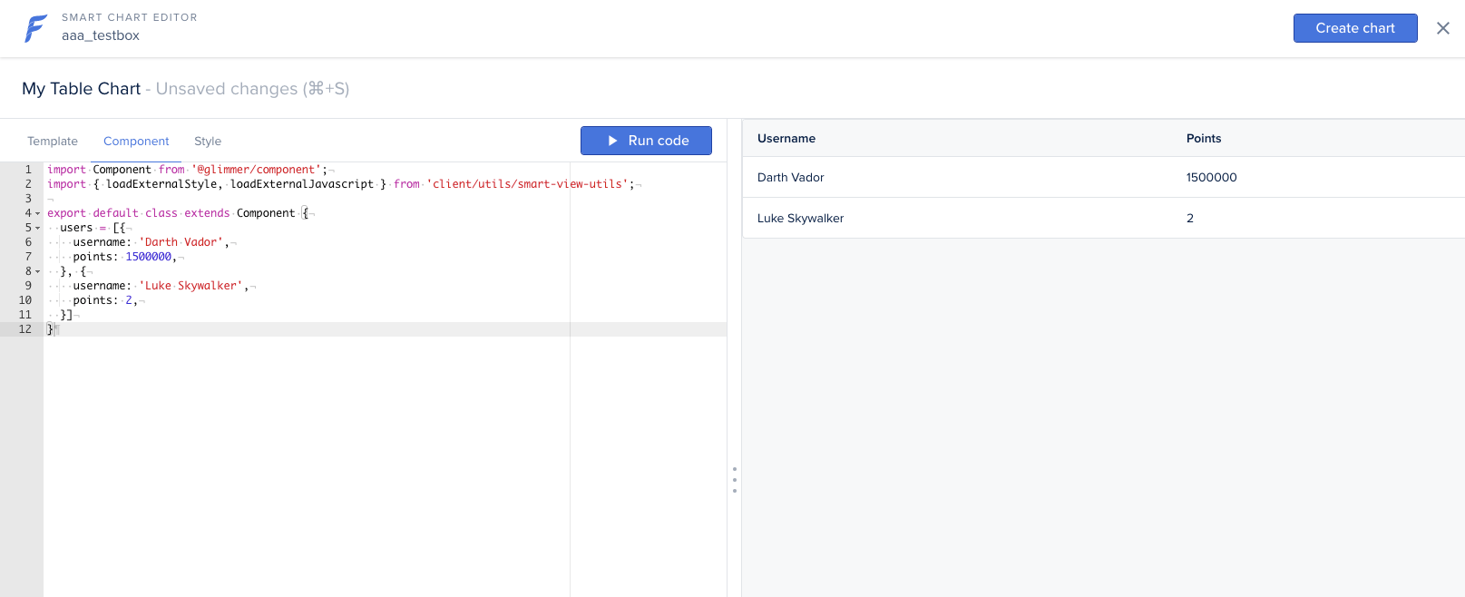
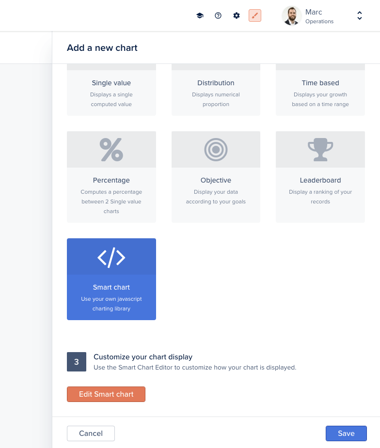 The editor exposes three tabs:
* **Template**, the Handlebars template that renders your chart
* **Component**, the JavaScript component that loads data and orchestrates rendering
* **Style**, optional CSS scoped to this chart
Click **Run code** at any time to preview the chart. When you're done, click **Create Chart** (or **Save** if already created).
The editor exposes three tabs:
* **Template**, the Handlebars template that renders your chart
* **Component**, the JavaScript component that loads data and orchestrates rendering
* **Style**, optional CSS scoped to this chart
Click **Run code** at any time to preview the chart. When you're done, click **Create Chart** (or **Save** if already created).
 When creating a Smart Chart on a specific record (record's Analytics tab), the `record` object is directly accessible via `this.args.record` in the component or `@record` in the template.
## Defining the data source on the back-end
A Smart Chart pulls its data from a custom endpoint you expose on the back-end with `addChart`. The handler returns any shape your component expects.
```javascript Node.js theme={null}
agent.addChart('mytablechart', async (context, resultBuilder) => {
// Load data from anywhere: your database, an external API, etc.
return resultBuilder.smart([
{ username: 'Darth Vader', points: 1500000 },
{ username: 'Luke Skywalker', points: 2 },
]);
});
```
```ruby Ruby theme={null}
@create_agent.add_chart('mytablechart') do |context, result_builder|
result_builder.smart(
[
{ username: 'Darth Vader', points: 1_500_000 },
{ username: 'Luke Skywalker', points: 2 },
]
)
end
```
```ruby Ruby DSL theme={null}
@create_agent.chart :mytablechart do
# `context` is available implicitly
smart(
[
{ username: 'Darth Vader', points: 1_500_000 },
{ username: 'Luke Skywalker', points: 2 },
]
)
end
```
The component then fetches `/forest/_charts/mytablechart` and passes the data to the template.
### Passing extra parameters
The chart handler's `context` exposes any custom query-string or body parameters sent to the chart endpoint via `context.parameters`, alongside `context.caller` (the current user). Use them to make a chart depend on a filter, a date range, or the current record:
```javascript theme={null}
agent.addChart('example', async (context, resultBuilder) => {
// Current user
const { email, timezone } = context.caller;
// Custom parameters from the request
const { startDate } = context.parameters;
const rows = await context.dataSource
.getCollection('orders')
.aggregate({}, { operation: 'Count' });
return resultBuilder.value(rows[0]?.value ?? 0);
});
```
For collection charts, `context` also exposes `context.recordId`, `context.compositeRecordId`, and `context.getRecord(fields)`.
## Example: table chart
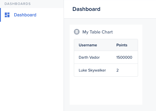
A minimal table chart in three steps: back-end endpoint, component fetch, template.
When creating a Smart Chart on a specific record (record's Analytics tab), the `record` object is directly accessible via `this.args.record` in the component or `@record` in the template.
## Defining the data source on the back-end
A Smart Chart pulls its data from a custom endpoint you expose on the back-end with `addChart`. The handler returns any shape your component expects.
```javascript Node.js theme={null}
agent.addChart('mytablechart', async (context, resultBuilder) => {
// Load data from anywhere: your database, an external API, etc.
return resultBuilder.smart([
{ username: 'Darth Vader', points: 1500000 },
{ username: 'Luke Skywalker', points: 2 },
]);
});
```
```ruby Ruby theme={null}
@create_agent.add_chart('mytablechart') do |context, result_builder|
result_builder.smart(
[
{ username: 'Darth Vader', points: 1_500_000 },
{ username: 'Luke Skywalker', points: 2 },
]
)
end
```
```ruby Ruby DSL theme={null}
@create_agent.chart :mytablechart do
# `context` is available implicitly
smart(
[
{ username: 'Darth Vader', points: 1_500_000 },
{ username: 'Luke Skywalker', points: 2 },
]
)
end
```
The component then fetches `/forest/_charts/mytablechart` and passes the data to the template.
### Passing extra parameters
The chart handler's `context` exposes any custom query-string or body parameters sent to the chart endpoint via `context.parameters`, alongside `context.caller` (the current user). Use them to make a chart depend on a filter, a date range, or the current record:
```javascript theme={null}
agent.addChart('example', async (context, resultBuilder) => {
// Current user
const { email, timezone } = context.caller;
// Custom parameters from the request
const { startDate } = context.parameters;
const rows = await context.dataSource
.getCollection('orders')
.aggregate({}, { operation: 'Count' });
return resultBuilder.value(rows[0]?.value ?? 0);
});
```
For collection charts, `context` also exposes `context.recordId`, `context.compositeRecordId`, and `context.getRecord(fields)`.
## Example: table chart
A minimal table chart in three steps: back-end endpoint, component fetch, template.
 **Component:**
```js theme={null}
import Component from '@glimmer/component';
import { inject as service } from '@ember/service';
import { tracked } from '@glimmer/tracking';
export default class extends Component {
@service lianaServerFetch;
@tracked users;
constructor(...args) {
super(...args);
this.fetchData();
}
async fetchData() {
const response = await this.lianaServerFetch.fetch(
'/forest/_charts/mytablechart',
{},
);
this.users = await response.json();
}
}
```
**Template:**
```handlebars theme={null}
{{user.username}}
{{user.points}}
```
## Example: bar chart with D3.js
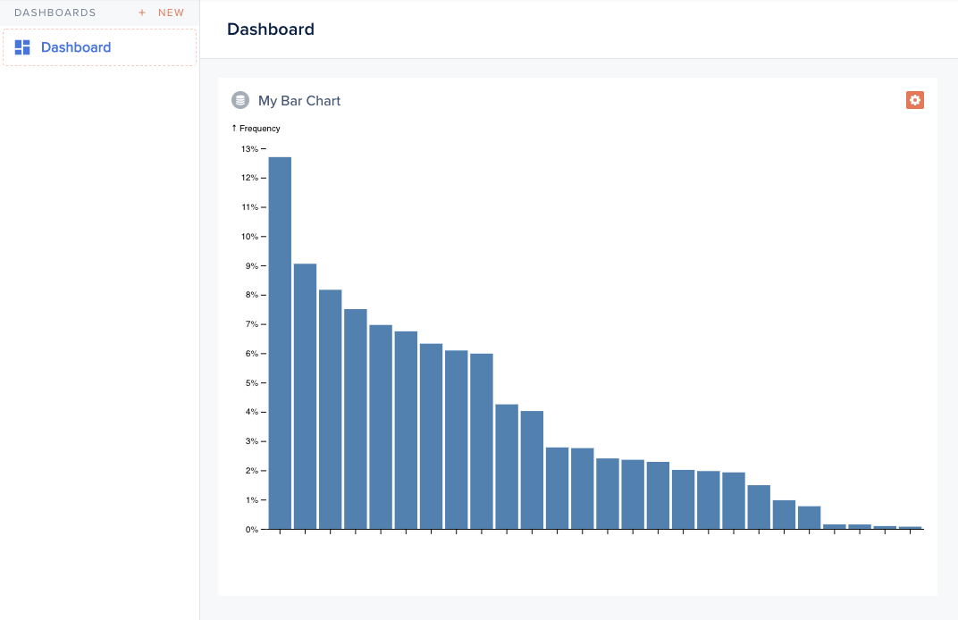
Smart Charts can load any external library. This bar chart uses [D3.js](https://d3js.org), inspired by [this example](https://observablehq.com/@d3/bar-chart).
**Component:**
```js theme={null}
import Component from '@glimmer/component';
import { inject as service } from '@ember/service';
import { tracked } from '@glimmer/tracking';
export default class extends Component {
@service lianaServerFetch;
@tracked users;
constructor(...args) {
super(...args);
this.fetchData();
}
async fetchData() {
const response = await this.lianaServerFetch.fetch(
'/forest/_charts/mytablechart',
{},
);
this.users = await response.json();
}
}
```
**Template:**
```handlebars theme={null}
{{user.username}}
{{user.points}}
```
## Example: bar chart with D3.js
Smart Charts can load any external library. This bar chart uses [D3.js](https://d3js.org), inspired by [this example](https://observablehq.com/@d3/bar-chart).
 **Back-end:**
```javascript theme={null}
agent.addChart('alphabetfrequency', async (context, resultBuilder) => {
return resultBuilder.smart([
{ name: 'E', value: 0.12702 },
{ name: 'T', value: 0.09056 },
{ name: 'A', value: 0.08167 },
// ...
]);
});
```
**Component (excerpt):**
```js theme={null}
import Component from '@glimmer/component';
import { loadExternalJavascript } from 'client/utils/smart-view-utils';
import { tracked } from '@glimmer/tracking';
import { inject as service } from '@ember/service';
export default class extends Component {
@service lianaServerFetch;
@tracked chart;
async load() {
await loadExternalJavascript('https://d3js.org/d3.v6.min.js');
const response = await this.lianaServerFetch.fetch(
'/forest/_charts/alphabetfrequency',
{},
);
const alphabet = await response.json();
this.renderChart(alphabet);
}
renderChart(alphabet) {
// d3 rendering logic: produce an SVG node
this.chart = svg.node();
}
}
```
**Template:**
```handlebars theme={null}
**Back-end:**
```javascript theme={null}
agent.addChart('alphabetfrequency', async (context, resultBuilder) => {
return resultBuilder.smart([
{ name: 'E', value: 0.12702 },
{ name: 'T', value: 0.09056 },
{ name: 'A', value: 0.08167 },
// ...
]);
});
```
**Component (excerpt):**
```js theme={null}
import Component from '@glimmer/component';
import { loadExternalJavascript } from 'client/utils/smart-view-utils';
import { tracked } from '@glimmer/tracking';
import { inject as service } from '@ember/service';
export default class extends Component {
@service lianaServerFetch;
@tracked chart;
async load() {
await loadExternalJavascript('https://d3js.org/d3.v6.min.js');
const response = await this.lianaServerFetch.fetch(
'/forest/_charts/alphabetfrequency',
{},
);
const alphabet = await response.json();
this.renderChart(alphabet);
}
renderChart(alphabet) {
// d3 rendering logic: produce an SVG node
this.chart = svg.node();
}
}
```
**Template:**
```handlebars theme={null}
{{this.chart}}
```
## Example: cohort retention chart
A retention table with shaded cells, also using D3.js.
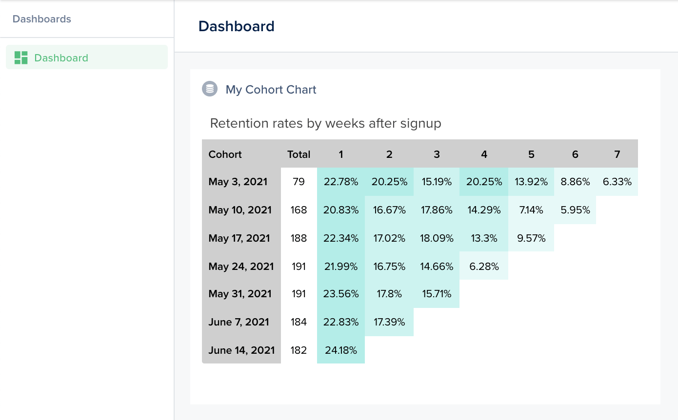 The back-end returns the cohort matrix; the component computes percentages and renders shaded cells; the template wraps the result.
```javascript theme={null}
agent.addChart('cohort', async (context, resultBuilder) => {
return resultBuilder.smart({
title: 'Retention rates by weeks after signup',
head: ['Cohort', 'New users', '1', '2', '3', '4', '5', '6', '7'],
data: {
'May 3, 2021': [79, 18, 16, 12, 16, 11, 7, 5],
'May 10, 2021': [168, 35, 28, 30, 24, 12, 10],
'May 17, 2021': [188, 42, 32, 34, 25, 18],
'May 24, 2021': [191, 42, 32, 28, 12],
'May 31, 2021': [191, 45, 34, 30],
'June 7, 2021': [184, 42, 32],
'June 14, 2021': [182, 44],
},
});
});
```
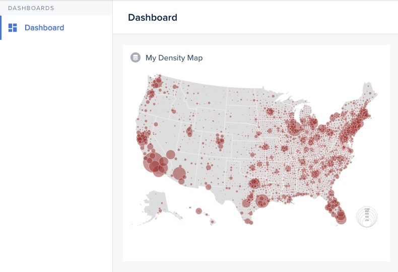
## Example: density map
A geographic density map, fetching contour data and population statistics, rendering with D3 + topojson.
The back-end returns the cohort matrix; the component computes percentages and renders shaded cells; the template wraps the result.
```javascript theme={null}
agent.addChart('cohort', async (context, resultBuilder) => {
return resultBuilder.smart({
title: 'Retention rates by weeks after signup',
head: ['Cohort', 'New users', '1', '2', '3', '4', '5', '6', '7'],
data: {
'May 3, 2021': [79, 18, 16, 12, 16, 11, 7, 5],
'May 10, 2021': [168, 35, 28, 30, 24, 12, 10],
'May 17, 2021': [188, 42, 32, 34, 25, 18],
'May 24, 2021': [191, 42, 32, 28, 12],
'May 31, 2021': [191, 45, 34, 30],
'June 7, 2021': [184, 42, 32],
'June 14, 2021': [182, 44],
},
});
});
```
## Example: density map
A geographic density map, fetching contour data and population statistics, rendering with D3 + topojson.
 ```javascript theme={null}
agent.addChart('densitymap', async (context, resultBuilder) => {
const contours = await fetch('https://example.com/counties-albers-10m.json').then(r => r.json());
const population = await fetch('https://example.com/population.json').then(r => r.json());
return resultBuilder.smart({ contours, population });
});
```
The component loads D3, topojson, then renders the SVG. See [this Observable notebook](https://observablehq.com/@d3/bubble-map) for the rendering logic.
```javascript theme={null}
agent.addChart('densitymap', async (context, resultBuilder) => {
const contours = await fetch('https://example.com/counties-albers-10m.json').then(r => r.json());
const population = await fetch('https://example.com/population.json').then(r => r.json());
return resultBuilder.smart({ contours, population });
});
```
The component loads D3, topojson, then renders the SVG. See [this Observable notebook](https://observablehq.com/@d3/bubble-map) for the rendering logic.